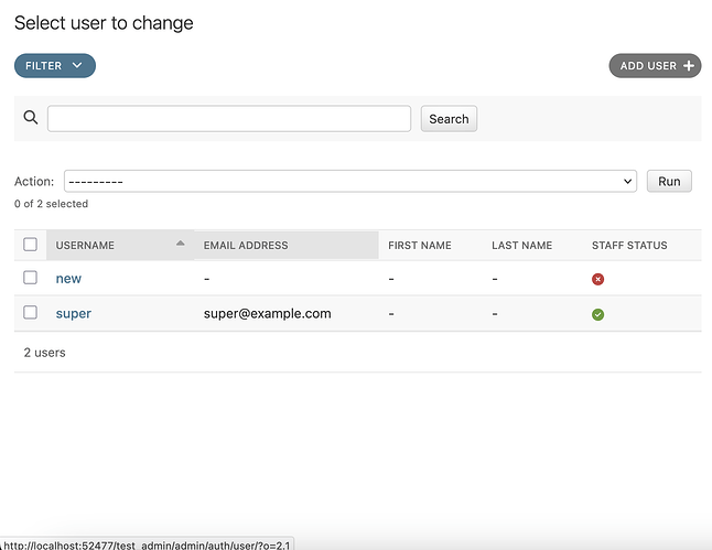
Currently, on mobile screens, the filter is located below the table.
What we need to consider here is that the filter panel can also become very long, and if the table has many rows, its height can become quite large as well.
For example, one issue with the current layout is when there are many rows.
When the table has many rows, you have to scroll down a lot to access the filter.
And if the filtered results are also numerous, you’d have to scroll down again to apply another filter.
If list_editable is enabled and there are tall columns like TextField or DateTimeField in list_display, this issue can become even more pronounced.
I believe the current layout structure is not ideal from a UX perspective.
(I’ve created an issue regarding this.)
I have submitted a PR(Although the tests have not been added yet, I believe this is enough to clearly show what I have in mind.) to address this issue.
The solution I came up with is as follows.
The filter panel is provided fixed at the bottom.
Since both the filter panel and the table can become long, I thought it would be better to provide the panel in a floating state rather than a static one.
However, this approach has the drawback of covering part of the screen.
When placed on the left or right side, it would cover table columns on mobile-sized screens, which is not ideal.
Therefore, I decided that placing it at the bottom, covering table rows instead, would be a better choice.
However, since the filter itself takes up about 40% of the screen height, it can naturally cause inconvenience for users on small screens like mobile devices.
Especially in situations where the filter is not needed.
Therefore, the filter is provided with a toggle so that users can use it only when necessary.
On
Off
I need feedback from many people ![]()
If you have any good ideas, please leave your comments on the PR or here!


