However the latter ticket is about collapsing individual items in the sidebar vertically, whereas the former one is about hiding the whole sidebar which provides more horizontal screen space, so the only similarity here is that these are related to the same sidebar (?)
The commenter reopening given ticket states that they’re affected by this, so implementation of #27471 havent apparently solved their issue.
I’m facing the same problem, so I’d like to challenge the decision for having this ticket closed, and I’m willing to contribute the code in case it could be reopened.
You don’t need an update to Django to do this as this can all be done by overriding the template admin/change_list.html and customising it to add a button with some js to toggle its visibility.
Eg I whipped up this ugly demo but it proves that with a bit of finesse to deal with margins and wrapping text it can be done quite easily:
I think this is probably best left in the realm of “customize if required”. The utility of the extra space really depends on the number of columns, content, and display width. And I think the UI here would always need an extra button, cluttering the UI, since making the header collapsible wouldn’t save the horizontal space.
Thanks for your comment. Neither of the answers here is disputing that the original reason for closing the ticket is not really justified.
To address some of the listed points:
yes, I can override the template. But if I will google for query like “django admin hide filter”, it will return plenty of results from Stackoverflow, Github and other various sites, showing that there is definitely a demand for given functionality, and I am not the only one who would “need to override template”. Results are dating even a decade back, so the solutions are usually outdated, thus more of them appearing over time, and these will most likely stop working again, so more of them will… ad infinitum.
The most straightforward way how to solve this issue would appear to be have this available out of the box. The ticket in question was previously already accepted before getting closed for irrelevant reason, so I dont believe I am that unreasonable to ask for given functionality.
I dont understand your point here. This exact functionality is already implemented for the sidebar on left side (so the same code and UI can be shared/reused for the sidebar on right side as well). If the button for collapsing sidebar wouldnt save any space, why do people keep implementing such functionality themselves (see previous paragraph), and why does this work for the sidebar on left side? This feels like you’re maybe disputing the “toggle filters” button on screenshot submitted by someone else, rather than any potentially better possible implementation (?)
Yes there would need to be a button, but I disagree with the “always” bit - if there is no filter in given view, the button doesnt need to be there. Calling that cluttering feels a bit overstated.
So to sum it up - there are some real cases where this would be beneficial (ie. small screen devices, I cant speak for motivation of other individuals), which can be improved by collapsing the sidebar, and the reason to not have this boils down to the fact there would need to be a button for this?
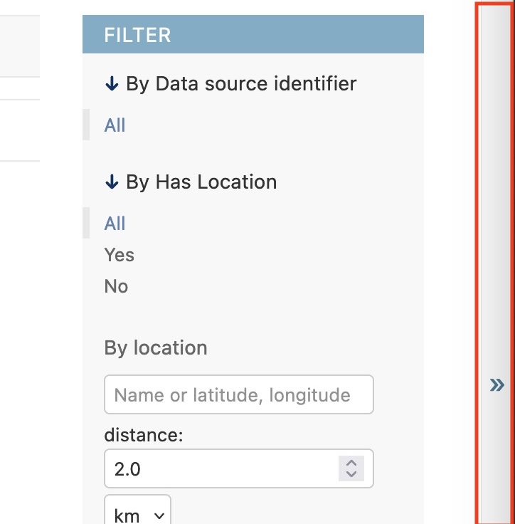
and for many years there was not much users could do about it, but then some good people delivered PR #12159 adding toggle-nav-sidebar on the left so you can hide the “model” list by clicking the << on the left:
Which makes things better, though if you don’t use filters very often, they can be more annoying than helpful. Now what I think we need here is another button on the right with >> in it which would allow to hide filters the same way we are hiding the models:
Now from what I see, ticket #21183 was accepted for development and the reason it was not merged is that, as it sometimes happens in the opensource world, the author of the original PR disappeared without fixing (rather small!) review comments.
The default User admin shows that it is not an issue which impacts “some” applications that use django admin - it’s practically all of them. In fact I have never seen a django-based system which wouldn’t have User admin or which would change it to len(display_fields) < 5.
I have seen, however, countless admin pages that suffered from insufficient horizontal space, in part because the filters covered a portion of the screen even on high resolutions. Please also note that some users nowadays stick a browser window to the side of the screen as their OS allows them to easily use one monitor to display two windows side by side as if they used two screens, which means again we have less horizontal space to work with despite increasing average screen resolution over time.
Ticket #21183 predates PR #12159, so in order to not duplicate things, some assets (js, css) should be reused. Fortunately someone now cares about it again and is willing to do what must be done
All discussion about adding to Django has to answer whether it can be easily already by using one of the customisation channels. That’s what my post was for
Here are some more points that need to be considered:
The admin is not a universal app framework for building an entire UI around. Updates to steer it in this direction are usually rejected. If people running into these issues are using in this manner then their experiences may be disregarded as evidence to make the change
There have been a lot of recent efforts to nail down the accessibility. All UI updates will likely need to adhere to these accessibility guidelines.
A lot of people want to add all sorts of things to the admin. The default position is, from my observations, rejection. If it wasn’t then we’d end up with a “Homer” car
After rejection the advice usually is “try creating the update as a 3rd party package and see how that goes in terms of popularity – if it gains traction this is a strong indication it should be added”
Accepted features add yet even more maintenance cost – who’s going to test & maintain that this works moving forward? 1 year from now, 10 years from now. The cost is not 0 and all minor features add up.
Now, having said all that, ppolewicz has given a positive argument:
prior art: there’s a similar feature already in use on the menu.
@shangxiao has said it better than me: “A lot of people want to add all sorts of things to the admin.” This statement has been true for as long as I’ve contributed to Django and if all had been accepted, the admin would be an unusable mess.
That said your responses, @yedpodtrzitko and @ppolewicz , have kind of swayed me. There have been a lot of people reimplementing this over the years. And yes, there would need to be a button, but it can be the same slim side button as the model list toggle. If we can adapt the code from the model list toggle, the feature may not be that large to add.
I think I’d like to see a proof of concept draft PR at this point. @ppolewicz did you put one together for your screenshots?
Your timeline is a little off here. In the old days you actually had more space. The sidebar and the ability to collapse it were added at the same time, which removed a few pixels of space rather than adding any.
Personally… I don’t mind one way or another, because the button doesn’t intrude very much. However, there’s a fair bit to think about:
How much JS can be re-used between the nav sidebar and the secondary(? - because it’s only on the right in LTR languages) sidebar.
How will accessibility work, what will the button be called, how will screenreader users know what is behind the button?
Will the sidebar need redesigning to look good with the full height filter sidebar?
The nav sidebar can (unfortunately) be disabled, which IIRC doesn’t load the JS.
If the sidebar is very long, does it cause a (third!) sidebar to appear? Is this okay?
How much JS can be re-used between the nav sidebar and the secondary(? - because it’s only on the right in LTR languages) sidebar.
all the JS is reused - it is extracted into the function handleSidebarToggle() (see PR) and that is used for both the sidebars.
How will accessibility work, what will the button be called, how will screenreader users know what is behind the button?
The button is a copy of the pre-existing sidebar button, ie. accessibility is identical with what it’s currently there, the value of its label is changed to “Toggle filters”.
The nav sidebar can (unfortunately) be disabled, which IIRC doesn’t load the JS.
That’s good catch, thanks. It looks like the approach in this regard varies among different components - for example the file admin/js/filters.js (other functionalities of the filter sidebar in question) is included always, no matter if the filters are actually present in the view or not.
Now if the functionality of sidebars would be shared, the file should be included if either of the sidebars is present. The current condition in base.html is {% if not is_popup and is_nav_sidebar_enabled %}. The Filter Sidebar is apparently present even when it’s a popup window, so the bit not is_popup should be removed. But rather than adding another variable like is_filter_sidebar_enabled into the mix, it could be better to simplify it and remove this whole condition altogether. The file is included by default in majority cases anyway, and the functionality is failsafe (ie. when element with given ID doesnt exist, nothing will happen).
If the sidebar is very long, does it cause a (third!) sidebar to appear? Is this okay?
Depends on what’s desired by you - is it preferred to have scrollbar for the sidebar, or scrollbar for the whole page? Currently it’s copying the behaviour of other sidebar (ie. custom scrollbar), but it can be changed if needed.
I’ve tagged myself to review, I will try to take a look at this soon and give some feedback.
I think I am now roughly in favour of this because it helps with (but doesn’t fix) another accessibility issue: for wide tables there is the possibility of multi-directional scrollbars, which are considered a bit nasty. Adding this means you can plausibly get another column or two in before this happens.
I think this is actually quite common, for two reasons. At work we have 4, for example.
A lot of people these days don’t use usernames anymore and use emails as login, so you remove the username field from the default set of list_display items. Further, two of the fields in the default models are booleans that don’t take up a lot of space.
If you’re using the user model for its recommended purpose (only auth, and using profile models for other data) then you shouldn’t have too many fields on your user model at all.
To me there are three fundamental questions to answer, probably in this order of priority:
User research: Does this feature request respond to a need of Django users?
Design philosophy / vision: does making this customizable align well with Django’s general approach / design philosophy?
User experience: can this be implemented with usability and accessibility at least as good or ideally better than as-is?
On the first point, it seems to me like it’s common for people to want to view data in a table like this, and for there to be enough fields that the table is bigger than the available space, particularly for a UI that aims to support small screens.
On the second point – I see lots of things being customizable in Django, so it seems reasonable to me that this would extend to the admin. Customizability also feels like a good way to preserve backwards compatibility (component is still unchanged by default, toggle can be unobtrusive or hidden entirely if really needed).
On the third point – as mentioned by Tom there are clear accessibility issues with content overflowing its container (can’t see all the content), and even moreso when there are overflows in multiple directions (can’t see the content, can’t see the scrollbars, easy to get lost when scrolling along multiple axis at once). So clearly there’s room for improvement by giving more space for the table.
There’s another issue with this FILTER panel which is that it’s after the table in the tab order and on the mobile layout. This makes it hard to reach for keyboard users, and easy to miss for people who are on a mobile device or use magnification. So I’d recommend changing this further than discussed so far to address those issues as well as the one about table width.
There are a few options here:
Move the FILTER block to the left, so it’s before the table both for keyboard tab and visual single-column order.
Move it to above the form, to also get it first in tab / visual order, while maximizing width even more so.
Or move it inside a modal / pop-over element, with only the toggle and currently-active filters visible when closed.
On maintainability – making a component toggle-able feels to me like a pretty basic UI change. The <details> element is well-supported in HTML, Django has similar components already, and writing integration tests for “disclosure on click” is very simple. If this poses a technical challenge I’d have concerns about the maintainability of the code in its current state rather than the consequences of such an addition.
Regarding #1, moving the sidebar to the left. I hope I dont misunderstand what you mean. But that would mean the main content could be horizontally offset to 1/2 of the screen by both the sidebars (eg. 14" screen I am using right now), which would feel very weird. Then both the toggling buttons would be next to each other, so in collapsed state there could be confusion which button is which. And moving between different models in admin, the content would be jumping left and right, depending if filter is active in particular view or not. This looks like a huge tradeoff just to have the sidebar accessible before the table.
Regarding #2 - the filter can have items with A LOT of items, so having it placed in a sidebar rather than offsetting the main content vertically is better here.
Regarding #3 - I am really not convinced a modal window can be considered a good solution from accessibility point of view, so it feels quite contradictory to the other points trying to improve it. I would also like to avoid scope-creeping, so changing the when/which filters are displayed shouldnt be discussed here.
Regarding scrollbars. As I mentioned above - the current behaviour was copied from the Nav Sidebar, ie. if the sidebar appears there, it will behave the same with the Filter Sidebar. I can adjust it in the PR the way which you want, I just need to know which one it is. Then should it change for the pre-existing sidebar as well? If so, shouldnt that be rather a new issue addressed separately?
The typical way around this would use a select input, what do you think of this? You can also collapse and expand individual filters, perhaps starting collapsed if there’s more than n objects to filter on.
In terms of accessibility it would be better to put the filters above the content semantically. I don’t think to the left is an option for the reasons you stated. The modal is an interesting option. They can be made accessible these days, especially now that we have the dialog element. But not sure, seems iffy to me.
One other possibility, though the admin css isn’t made for this, is to have the elements ordered semantically (filters first, and above on mobile) but change the flex ordering with CSS to keep it on the right visually. Not sure what you’d think about that, @thibaudcolas? I think it might still have other issues.
Yes, I’d recommend to always avoid flexbox reordering. There’s very few scenarios where it’s the right move. So always use the semantic / DOM order matching the keyboard / mobile UI order.
@yedpodtrzitko yes, all you said is spot on – two sidebars to the left being weird; vertical scrolling being undesirable; and scope-creep being something we should avoid. The fundamental problem here is we’re trying to solve one UX issue within a UI that has tens of them. And very few people in this contributors community think admin users’ experience is worth improving enough to warrant doing that in django/django.
Personally I think progress is progress, is progress. So if you worked to make the FILTER sidebar collapsible, that seems like a great improvement to me, and a worthwhile contribution in its own right. It does feel like a band-aid however for the reasons I mentioned above.
Alternative designs
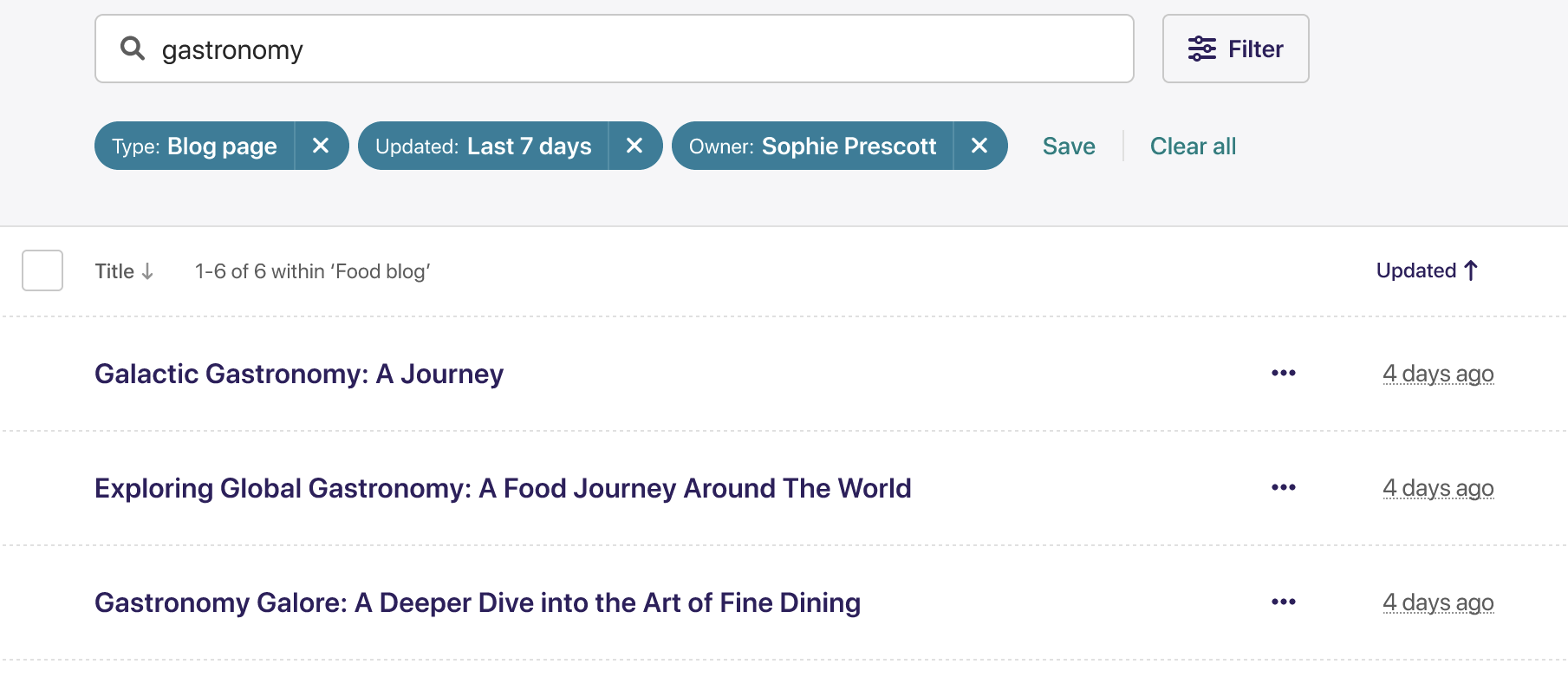
If you want to consider possible “scope-creep” alternatives further, here is an example “nav sidebar + filterable listings”. With the toggle-able filters in the top header area. Here this is shown with the filters modal already opened, revealing five filter types:
We’ve designed this to solve exactly the same issue as here – listing tables with lots of columns, which we want to have as much horizontal space and vertical space for as possible. And we need the filters in a more logical place for keyboard and mobile users. It’s trade-offs all around if you want to have your cake and eat it too. Not everyone uses filters. Those who do can still find them, the UI is more complex. Here’s a demo page with the current UI this would replace.
I’ll be building this some time over the next 2 months so can report back on the complexity.
I’m not saying this is the right design for Django, again have to be realistic with what is possible within a project that currently keeps to very basic UI/UX paradigms. But thought I’d share anyway just to clarify what I mean by “above the form” and “modal”. A more realistic version of this would be what @tom suggests with filters displayed side-by-side in a row in the header, and individually expandable, with a pattern to reveal the values when filtering.
This all seems fair. I think we should aim to have something better, but for now I think this improvement is still an improvement, even if it still has issues. I’ll review on that basis.
Last time I checked (maybe it has changed since then?) there was no builtin support for <select> in the filters, so in order to not compromise usability / screen space I’d need to find and install an extensions to even make this possible. So this doesnt feel like a good option to me.
Also who gonna decide how many options is too many to collapse it automatically? I dont think there’s one universal value which would fit everyone, as someone wants to see all the options no matter what, and someone with 12" screen would see the threshold elsewhere than someone with 30" screen.
There would be a similar issue with content jumping (up and down this time) when moving among models with/without filters, similarly as if the filter would be on the left side. Now I’m not sure if we’re discussing option that all the filters are visible by default, in which case what would happen if there would be too many of them - would they expand to the next row or would there be another scrollbar to keep them all in one row?
I wouldnt mind participating on this, but again it feels like a totally different new feature out of scope for this task
It looks very polished, but in comparison with the current filter sidebar I see one tradeoff I dont like already. Let’s take the example with “Date updated” from the screenshot. Currently sidebar, I click directly on the “This week” in the sidebar. Done within one click.
With the proposed design I click “Filter” → “Date Joined” → “This week”. Three clicks, if I’m not gonna be clumsy… that feels like a step back in terms of usability.